Usage Guide

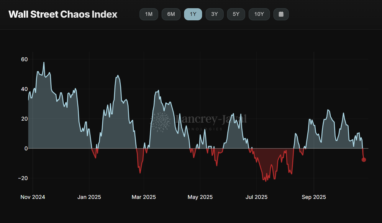
The Wall Street Chaos Index (WSCI) tracks, in real time, expressions of negativity, criticism, anxiety, and pessimism within conversations among finance professionals on Twitter.
More specifically, Narval’s LLM analyzes these discussions by contrasting those with a negative tone against those with a positive tone, producing a sentiment ratio ranging from -100 to 100. The closer the ratio is to -100, the more chaotic the discussions; conversely, a ratio above 0 indicates growing optimism.
The WSCI dashboard provides access both to the global WSCI, which tracks the tone of all professional discussions across Wall Street regardless of topic, and to sector-level WSCI indices, which focus on specific thematic areas. All WSCI indices can be visualized across six predefined timeframes (1M, 6M, 1Y, 3Y, 5Y, and 10Y) or over a custom period using the calendar tool. A download button in the top-right corner of the dashboard also allows users to export the displayed data in CSV format.
Last updated: 10-25-2025

The main WSCI chart displays the daily evolution of the Chaos/Hope sentiment ratio, derived from Narval’s analysis of discussions among Wall Street professionals. This sentiment ratio ranges from -100 to 100: a negative ratio indicates the prevalence of chaotic discussions, while a positive ratio reflects a more optimistic tone.
As this data is updated in real time and fluctuates throughout the day, each daily data point becomes final only at midnight (Paris time).
Above the main chart, several buttons allow users to switch between predefined timeframes — 1M, 6M, 1Y, 3Y, 5Y, and 10Y — or to view the index over a custom period using the calendar tool. The CSV export button, located in the top-right corner of the dashboard, only allows exporting the historical daily data currently displayed on the main chart.
Last updated: 10-25-2025

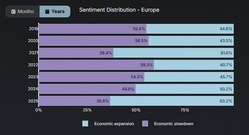
The sentiment distribution chart allows you to visualize, for a given theme and geographic area, the breakdown of economic sentiment over past periods.
This represents aggregated data for a selected timeframe, as opposed to the main chart, which displays the evolution of daily data points. Similar to the main chart, only discussions showing a clear positive or negative sentiment are aggregated here — conversations related to the selected theme but with a neutral tone are excluded.
The toggle switch in the top-right corner of the chart allows you to change the timeframe, displaying the sentiment distribution either by month or by year. You can also isolate a specific sentiment by clicking on the squares in the legend at the bottom of the chart.
Last updated: 10-25-2025

Present across all dashboards on the site, the Community Panel displays the socio-professional composition of the individuals behind the conversations tracked by Narval. The five categories of the Community Panel are: Portfolio Managers, Chief Economists, Market Strategists, Macro Strategists, and Financial Journalists.
For any given theme and time period, the composition of the Community Panel accurately reflects the proportion of each profession contributing to the dataset from which the displayed results — such as trend curves and sentiment distributions — are derived.
The professionals included in the panel are selected according to the proprietary methodology developed by Lancrey-Javal Technologies, ensuring that only the most informed and competent voices in each field are represented independent of social-media influence or popularity. This approach eliminates discussion noise and guarantees the high informational value of the collected data.
Last updated: 10-25-2025

The Wall Street Thematic Index (WSTI) tracks in real time the evolution of discussion topics among Wall Street professionals across 20 different market themes.
Using the buttons in the top-right corner of the dashboard, users can choose between viewing raw data — representing the daily number of occurrences of a given theme — or normalized data, which corresponds to the raw count weighted by the average number of messages. The normalized view is particularly useful for identifying underlying discussion trends, independently of daily fluctuations in total message volume, which are multifactorial.
As the data is updated in real time and changes throughout the day, each daily data point becomes final only at midnight (Paris time). Above the main chart, several buttons allow users to switch between predefined timeframes (1M, 6M, 1Y, 3Y, 5Y, and 10Y) or over a custom period using the calendar tool. The CSV export button, located in the top-right corner of the dashboard, only allows exporting the historical daily data currently displayed on the main chart.
Last updated: 10-25-2025

The Topics & Entities chart allows users to visualize, for one or several selected themes, the top five unique keywords most frequently mentioned in discussions among Wall Street professionals.
For four specific themes (Monetary Policy, Corporate Activity, Armed Conflicts, and Politics) it is also possible to view the top five entities (either individuals or organizations) most frequently cited in these discussions.
When combined with the custom period selection tool, this feature makes it possible to explore which topics or entities dominated professional discussions at any given point in time.
Last updated: 10-25-2025

The Associated Themes table allows users to visualize, for one or several selected themes, the eight themes most closely associated with them within professional discussions. It displays the exact count of each theme over a given period, as well as the correlation between the selected theme(s) and other related topics.
This feature provides valuable analytical insight into how market narratives and discussion topics evolve together, helping to identify co-movements, thematic clusters, or shifts in professional focus across time.
Last updated: 10-25-2025

Present across all dashboards on the site, the Community Panel displays the socio-professional composition of the individuals behind the conversations tracked by Narval. The five categories of the Community Panel are: Portfolio Managers, Chief Economists, Market Strategists, Macro Strategists, and Financial Journalists.
For any given theme and time period, the composition of the Community Panel accurately reflects the proportion of each profession contributing to the dataset from which the displayed results — such as trend curves and sentiment distributions — are derived.
The professionals included in the panel are selected according to the proprietary methodology developed by Lancrey-Javal Technologies, ensuring that only the most informed and competent voices in each field are represented independent of social-media influence or popularity. This approach eliminates discussion noise and guarantees the high informational value of the collected data.
Last updated: 10-25-2025

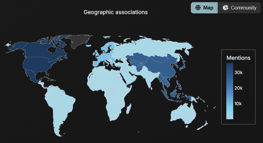
The WSTI World Map allows users to visualize the geographical associations of the selected theme(s). In other words, the map shows which countries, regions, or continents are most frequently linked to discussions among Wall Street professionals for a given topic.
For example, in the tweet “The New York Fed has revised down its growth projections for the U.S. domestic market,” the theme Growth & Business Cycle would be geographically associated with North America.
However, the WSTI World Map does not display the geographical origin of the community panel members.
Last updated: 10-25-2025

The Wall Street Economic Outlook (WSEO) allows users to visualize the economic expectations of Wall Street professionals for a given economic theme and geographical zone.
Each theme has its own benchmark for market expectations: expansion / slowdown (Growth & Business Cycle), higher / weaker inflation (Inflation), stronger /weaker employment (Labor Market), and tightening/easing (Monetary Policy). For example, in the case of the Growth & Business Cycle theme for the United States, Narval analyzes professional discussions to determine the share of messages referring to economic expansion versus those referring to economic slowdown in the U.S. This produces a sentiment ratio ranging from -100 to 100, where a positive ratio indicates a prevailing expectation of economic expansion, and a negative ratio reflects a prevailing expectation of economic slowdown.
Last updated: 09-25-2025

As this data is updated in real time and fluctuates throughout the day, each daily data point becomes final only at midnight (Paris time).
The main WSEO chart displays the daily evolution of the Chaos/Hope sentiment ratio, derived from Narval’s analysis of discussions among Wall Street professionals. This sentiment ratio ranges from -100 to 100: a negative ratio indicates the prevalence of chaotic discussions, while a positive ratio reflects a more optimistic tone.
Above the main chart, several buttons allow users to switch between predefined timeframes — 1M, 6M, 1Y, 3Y, 5Y, and 10Y — or to view the index over a custom period using the calendar tool. The CSV export button, located in the top-right corner of the dashboard, only allows exporting the historical daily data currently displayed on the main chart.
Last updated: 10-25-2025

The sentiment distribution chart allows you to visualize, for a given theme and geographic area, the breakdown of economic sentiment over past periods.
This represents aggregated data for a selected timeframe, as opposed to the main chart, which displays the evolution of daily data points. Similar to the main chart, only discussions showing a clear positive or negative sentiment are aggregated here — conversations related to the selected theme but with a neutral tone are excluded.
The toggle switch in the top-right corner of the chart allows you to change the timeframe, displaying the sentiment distribution either by month or by year. You can also isolate a specific sentiment by clicking on the squares in the legend at the bottom of the chart.
Last updated: 09-25-2025

For any given theme and time period, the composition of the Community Panel accurately reflects the proportion of each profession contributing to the dataset from which the displayed results — such as trend curves and sentiment distributions — are derived.
Present across all dashboards on the site, the Community Panel displays the socio-professional composition of the individuals behind the conversations tracked by Narval. The five categories of the Community Panel are: Portfolio Managers, Chief Economists, Market Strategists, Macro Strategists, and Financial Journalists.
The professionals included in the panel are selected according to the proprietary methodology developed by Lancrey-Javal Technologies, ensuring that only the most informed and competent voices in each field are represented independent of social-media influence or popularity. This approach eliminates discussion noise and guarantees the high informational value of the collected data.
Last updated: 10-25-2025